Why That (feat. AK3M) by Akal Inder
Project Info
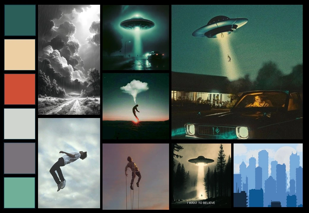
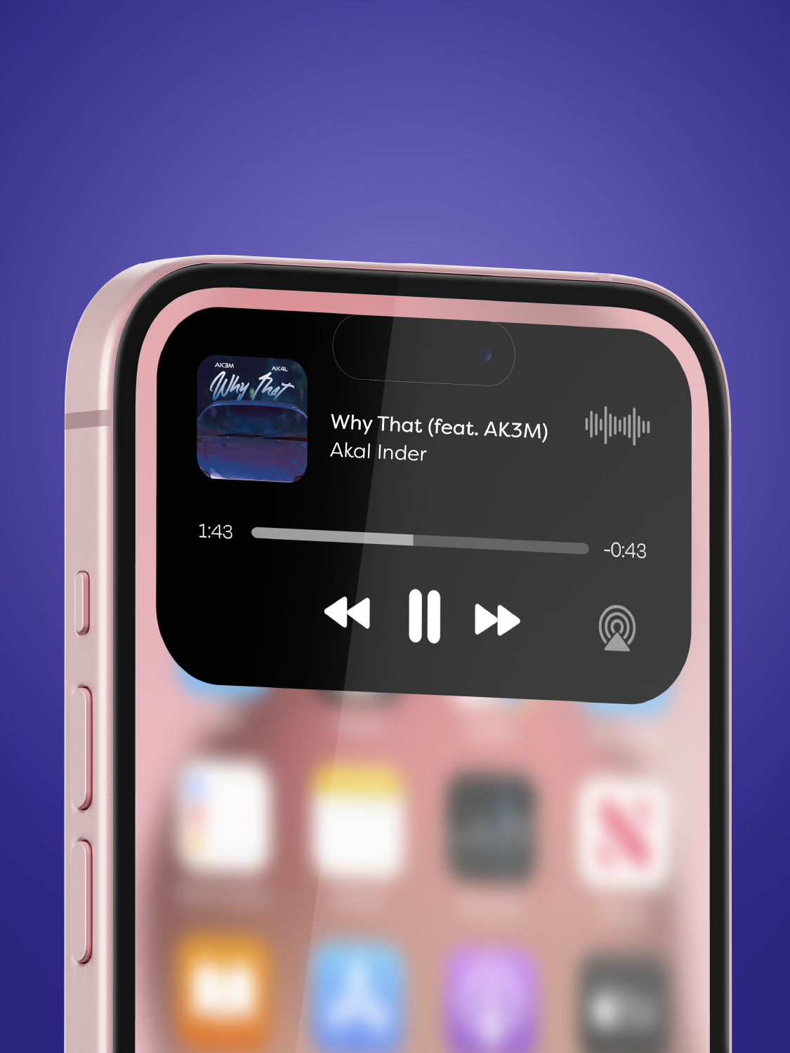
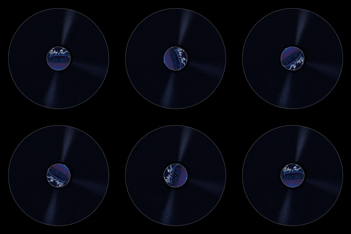
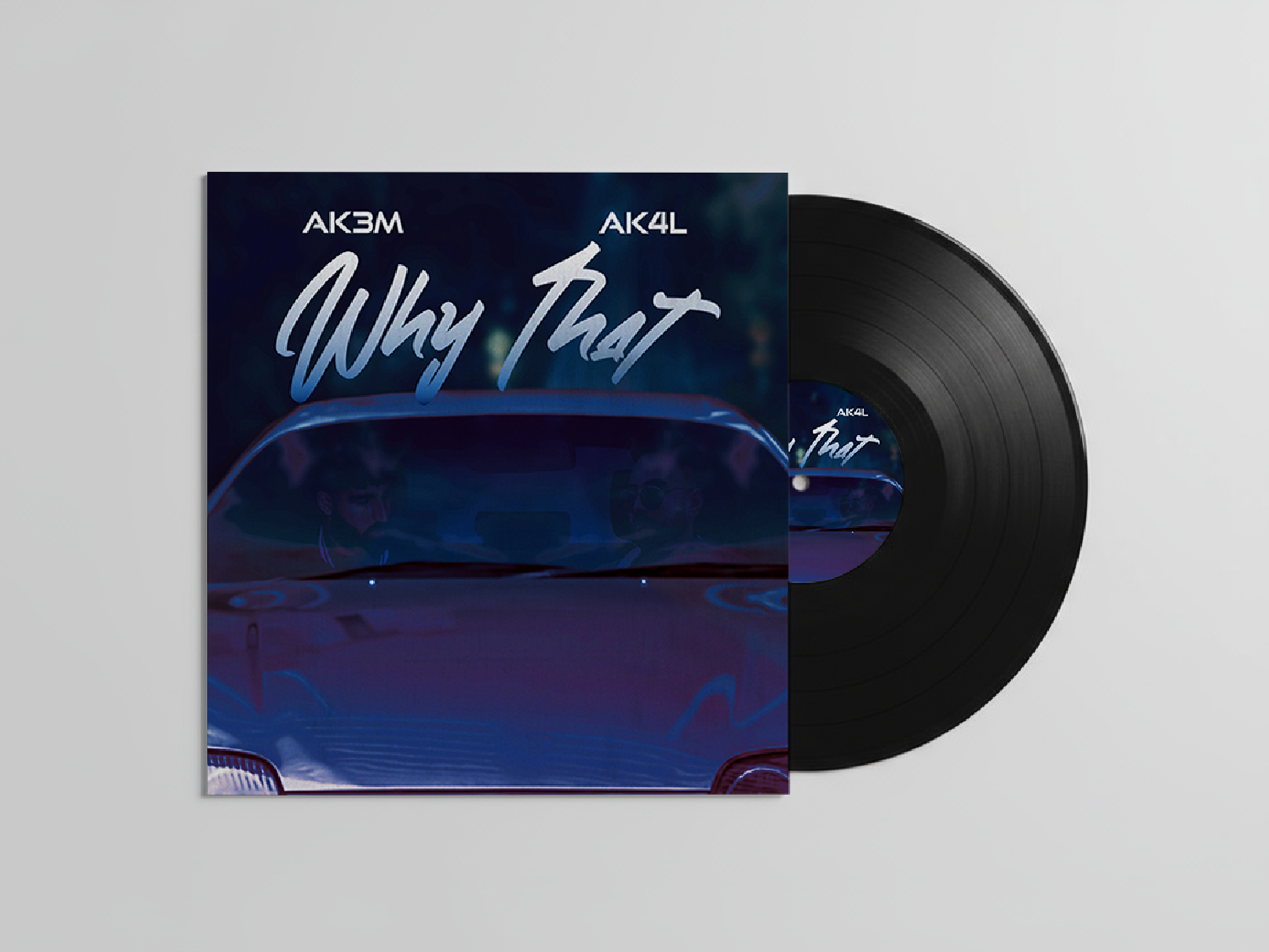
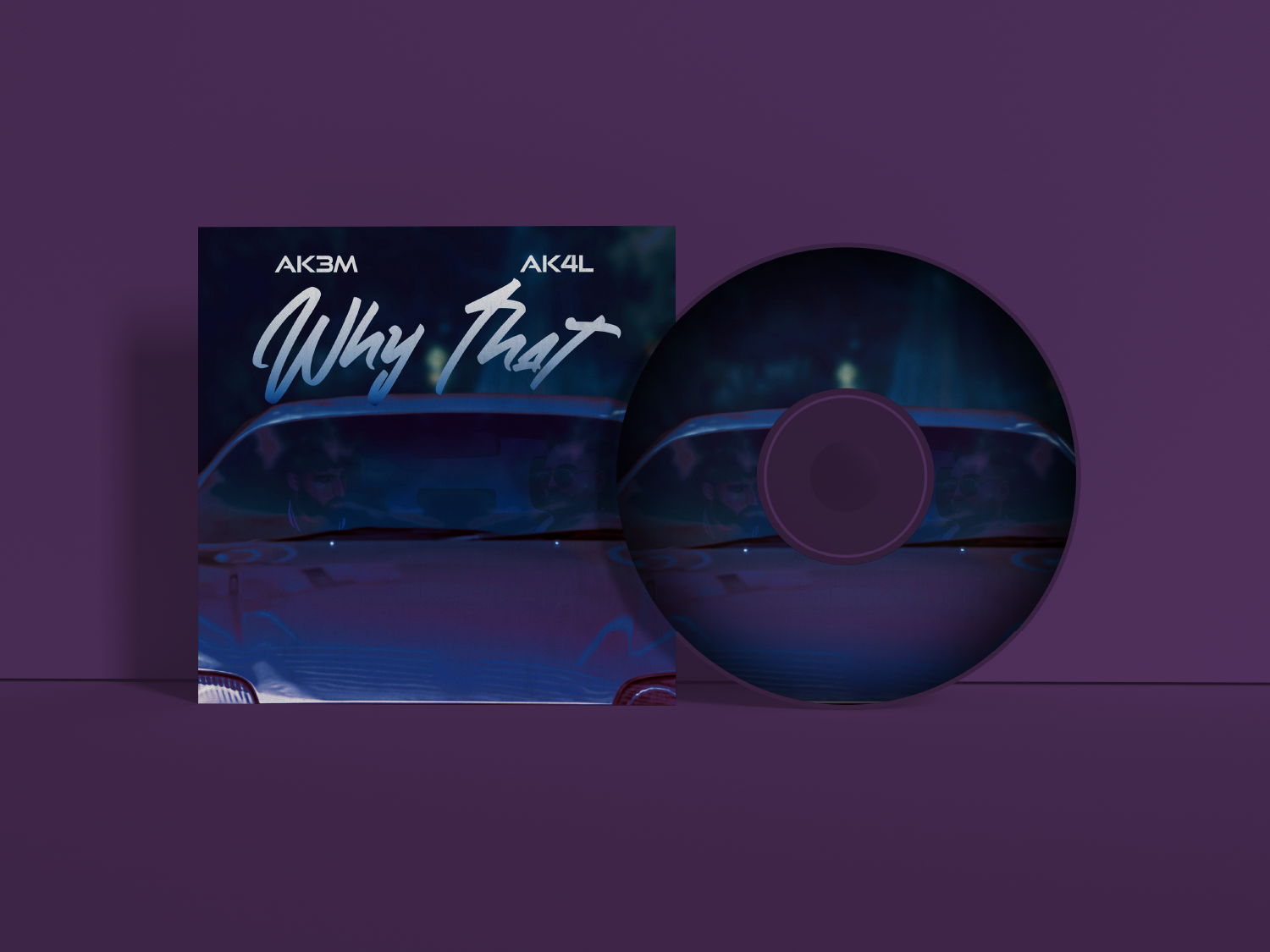
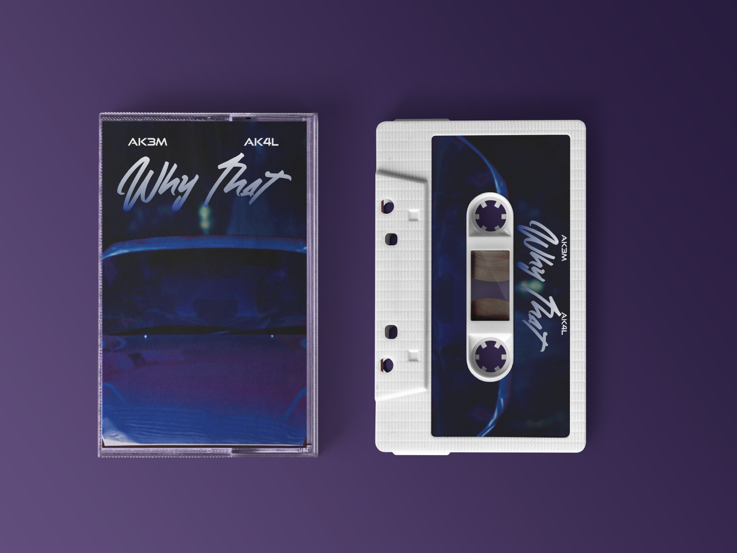
Single cover design for “Why That†by Punjabi artist Akal Inder and producer AK3M, based out of Detroit, Michigan. The project focuses on creating cinematic album artwork with a late-night visual tone, using moody lighting, restrained colour, and atmospheric composition to reflect the sound and feeling of the track.
Why That (feat. AK3M)

Project Details
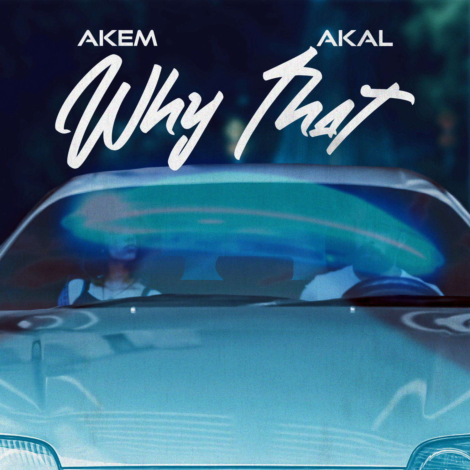
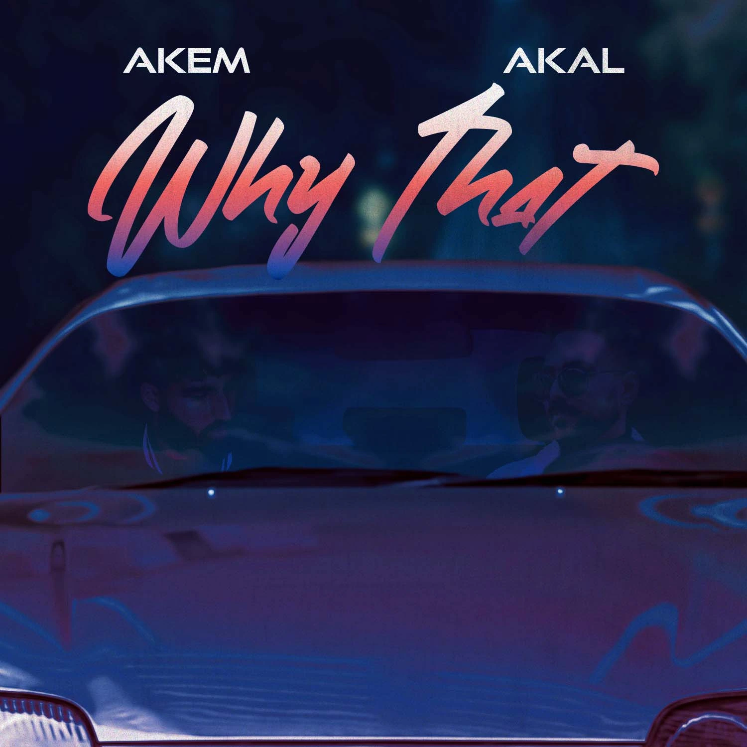
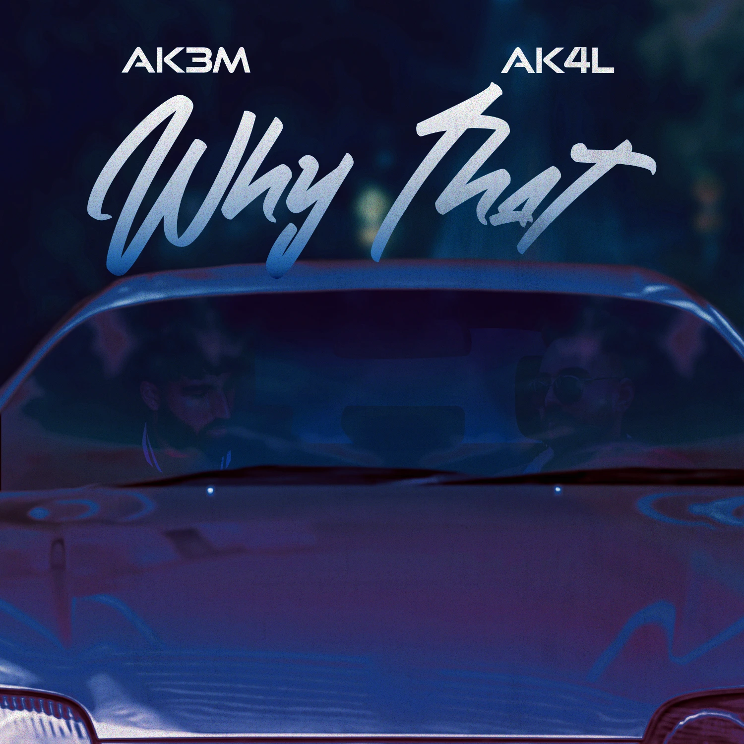
The cover is built around a dark, neon-lit car scene that gives the artwork an intimate and cinematic quality. The image places the artists inside the vehicle, using the windshield as a visual barrier that creates distance, mood, and tension. This framing supports the reflective nature of the song without over-explaining the emotion.
Colour is kept within a controlled blue and red range, giving the piece a late-hour atmosphere while avoiding unnecessary visual noise. The lighting, blur, and low-contrast details create a sense of movement and privacy, making the cover feel closer to a still from a film than a standard promotional graphic.
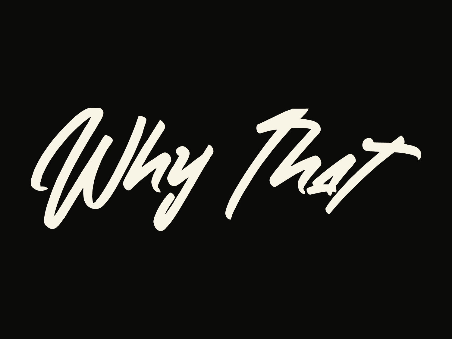
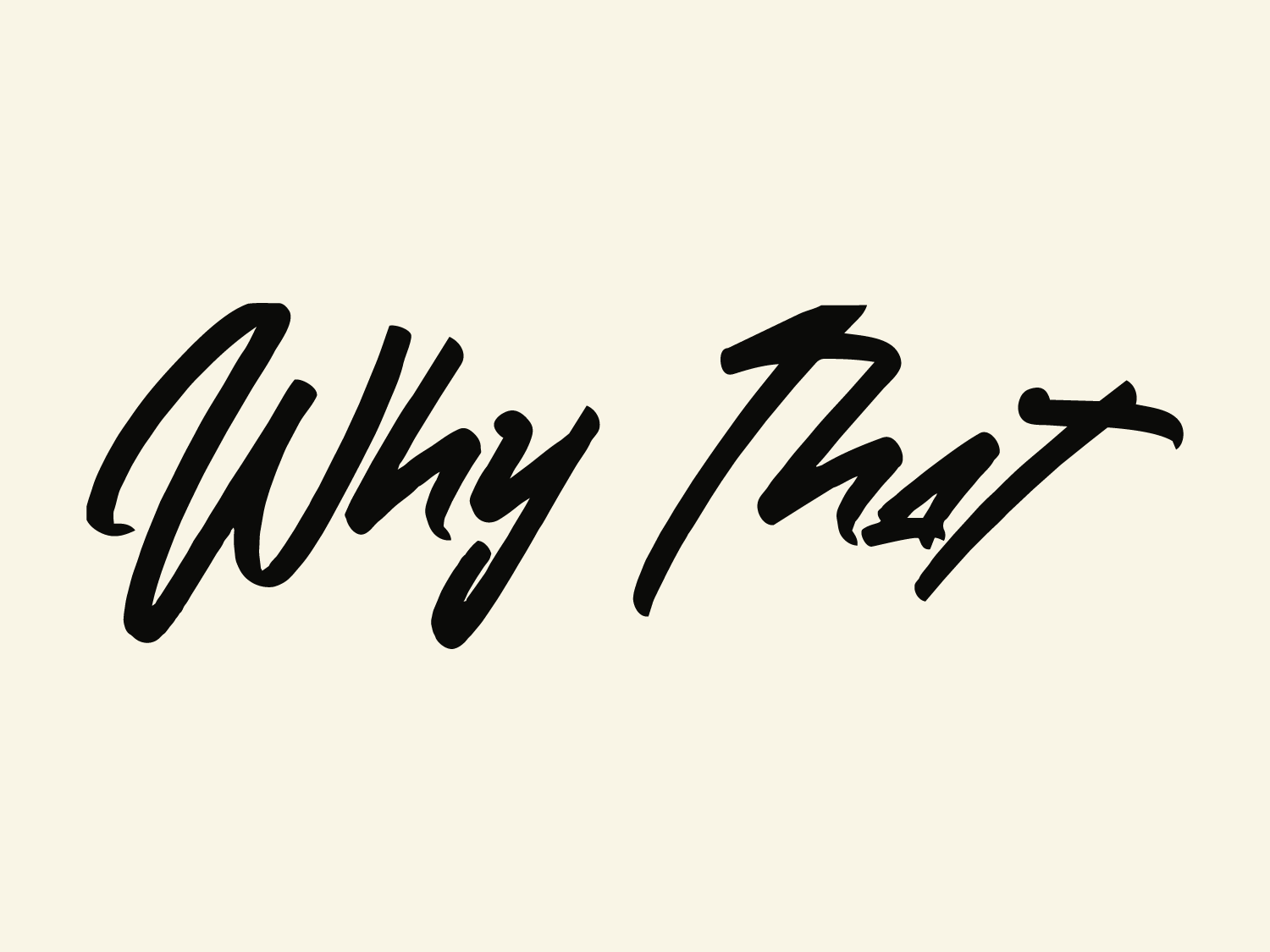
Typography is treated as a major visual element, with the script-style title adding contrast against the sharper artist marks above it. The type supports the emotional tone of the track while keeping the artist names and song title readable at streaming-platform scale. The final cover balances music branding and atmosphere to create artwork that feels cinematic, personal, and built for digital release.