
Moby Dick; or, the Whale
Project Info
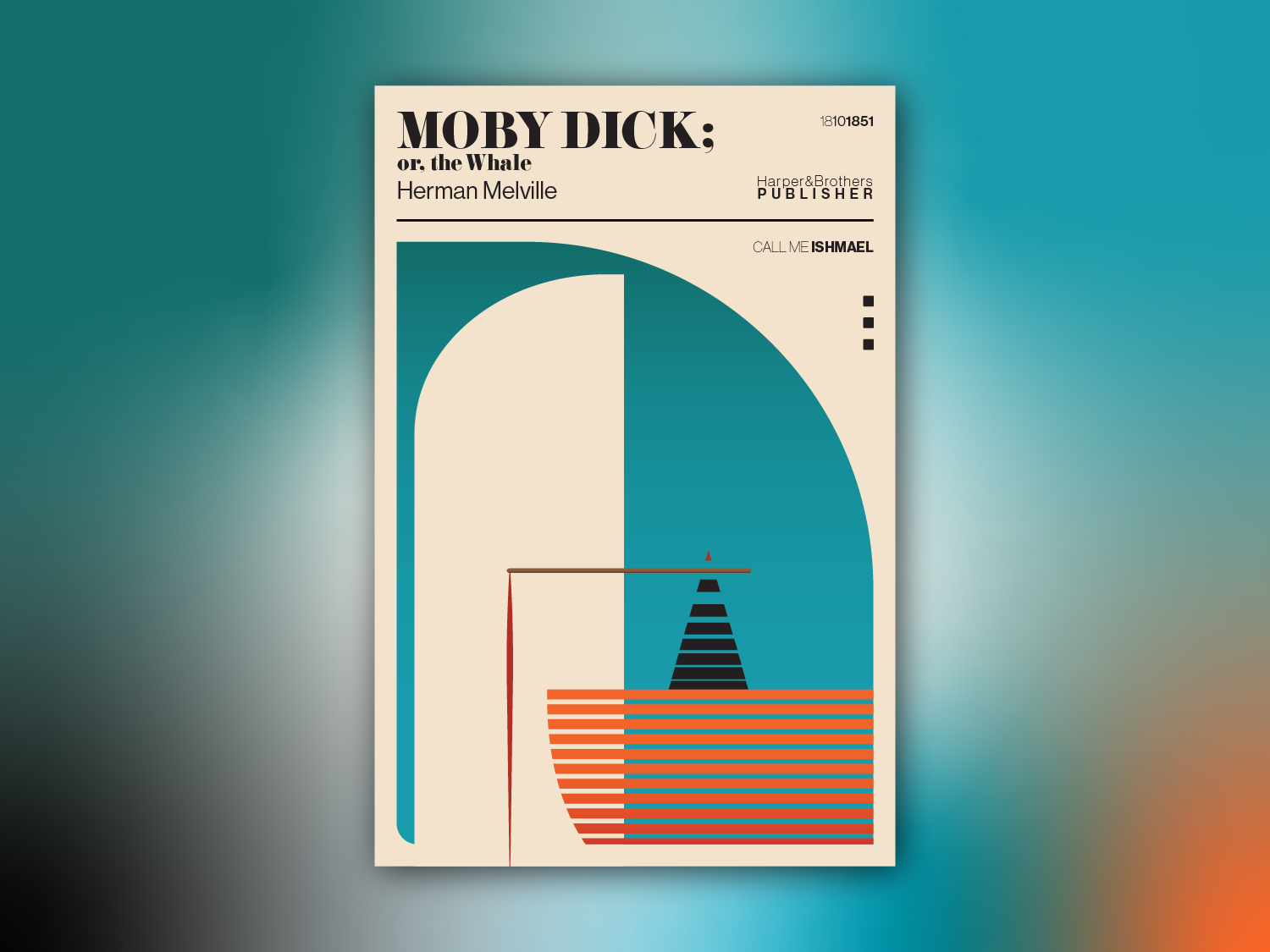
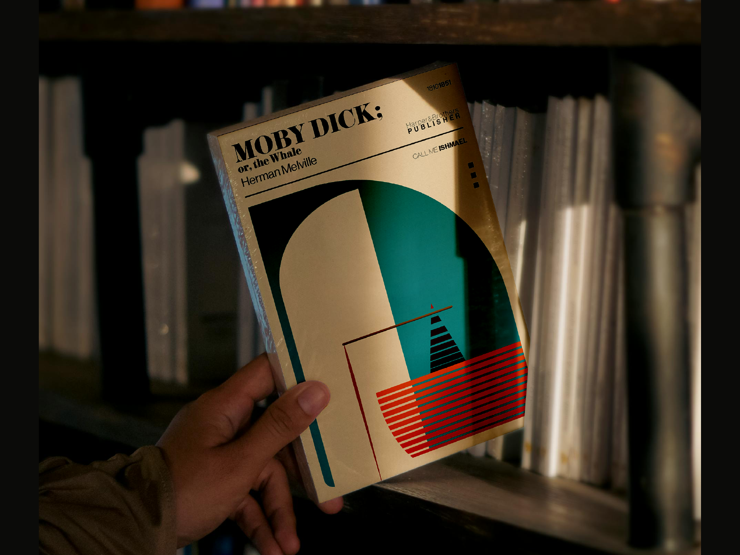
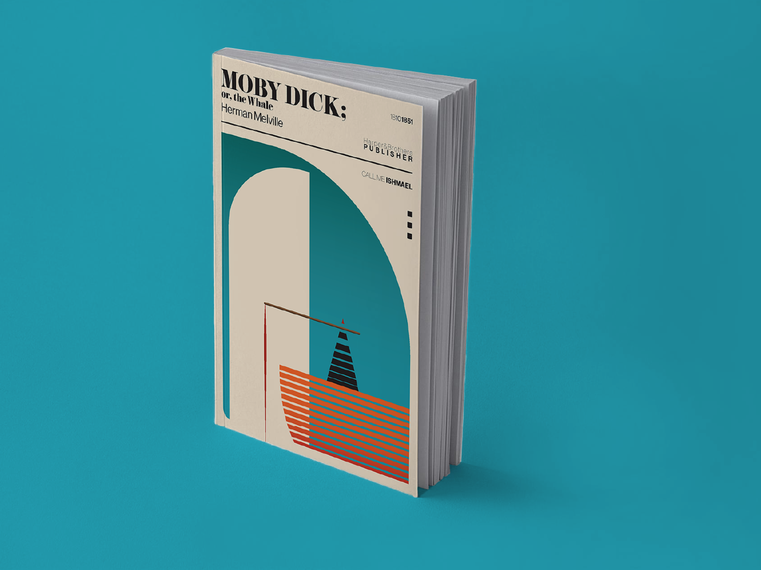
Conceptual book cover redesign for Moby-Dick; or, the Whale by Herman Melville, exploring minimalist editorial design through abstraction, typography, and composition.
Project Details
This project focuses on reinterpreting a piece of classical literature without relying on literal illustration. The objective was to translate the scale, tension, and underlying themes of the novel into a visual system built on reduction, contrast, and controlled composition. The design uses geometric forms and negative space to suggest the presence of the whale and the surrounding environment, rather than depicting them directly.
Typography is integrated into the layout as part of the overall system, supporting hierarchy and rhythm instead of functioning as a separate layer. The colour palette is limited but deliberate, adding emphasis while maintaining focus on the core concept. The result is a cover that communicates through structure and restraint, allowing the idea to hold without relying on detail or narrative cues.


