Wagh Bakri
Project Info
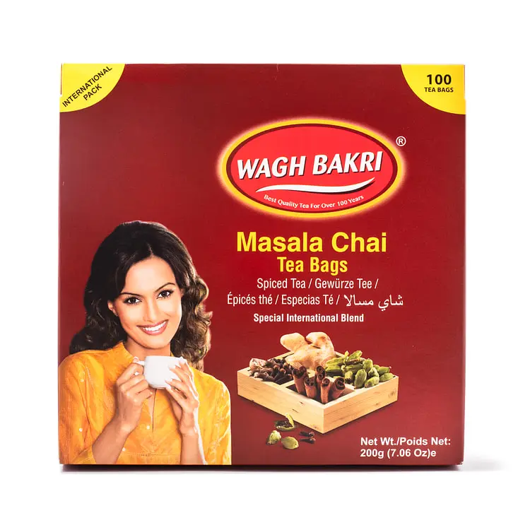
Packaging redesign for Wagh Bakri Masala Chai focused on improving hierarchy, shelf impact, and usability while maintaining brand recognition and cultural references.
Project Details
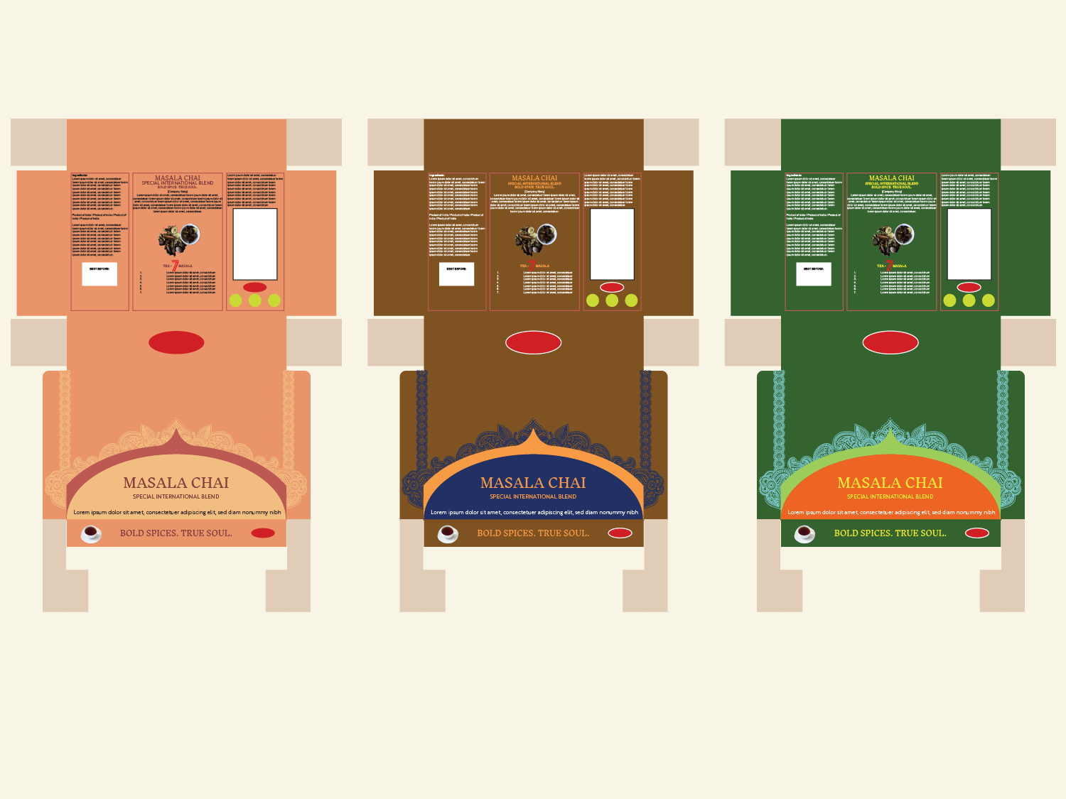
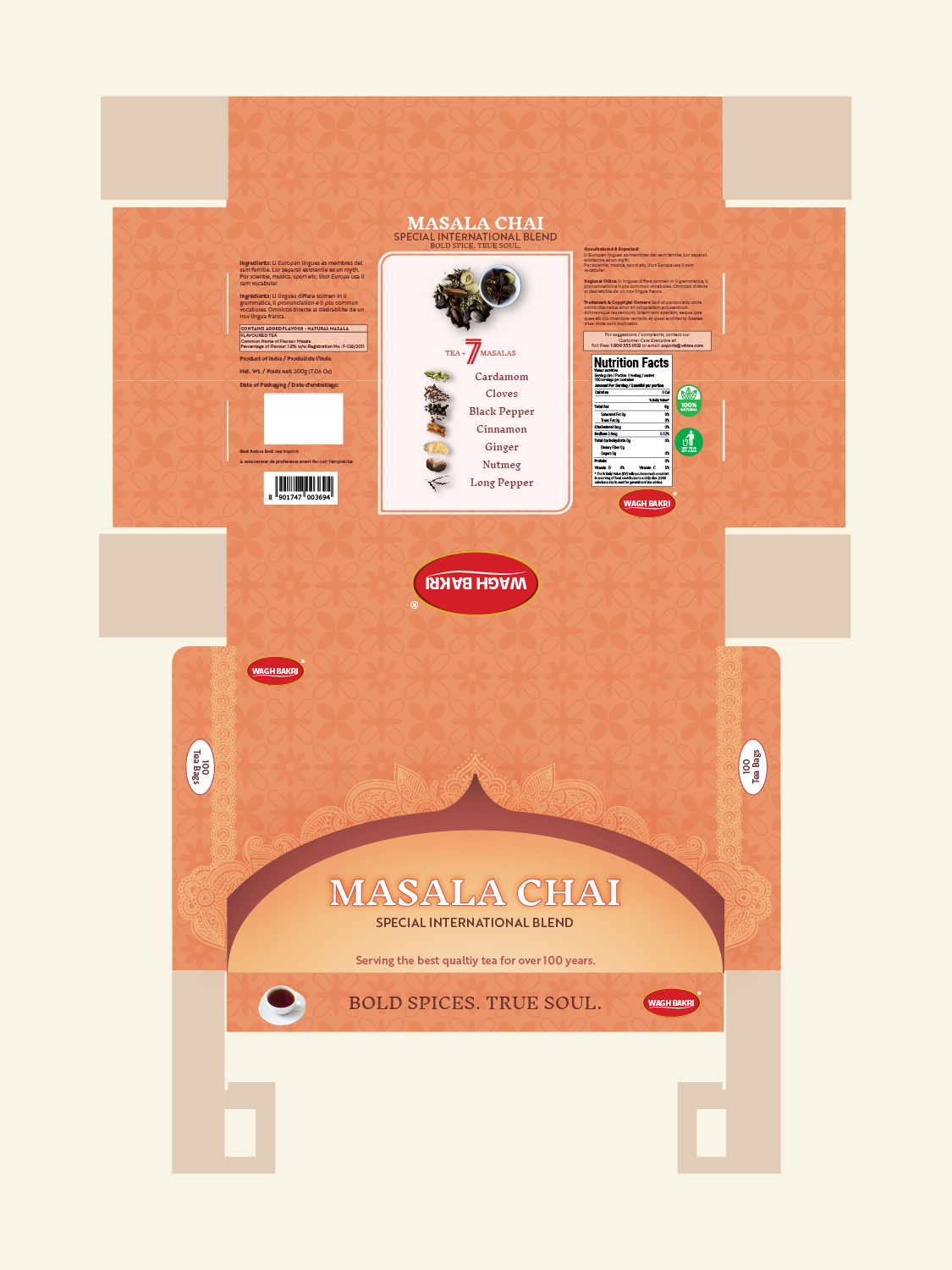
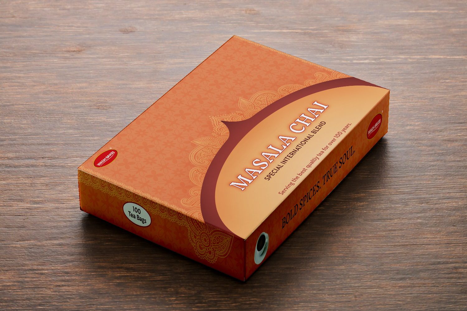
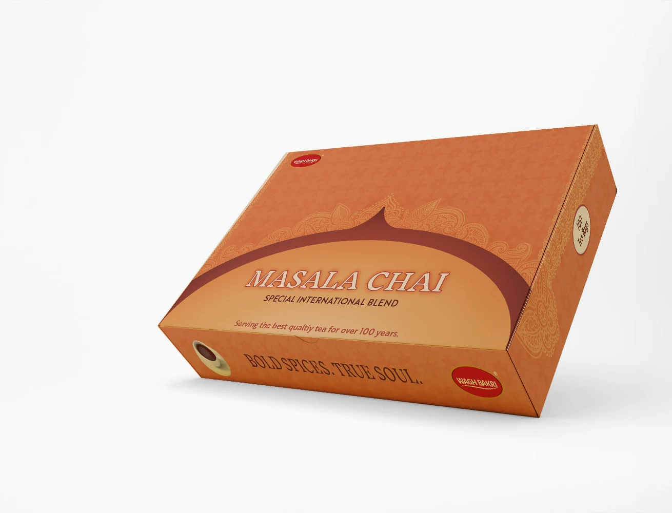
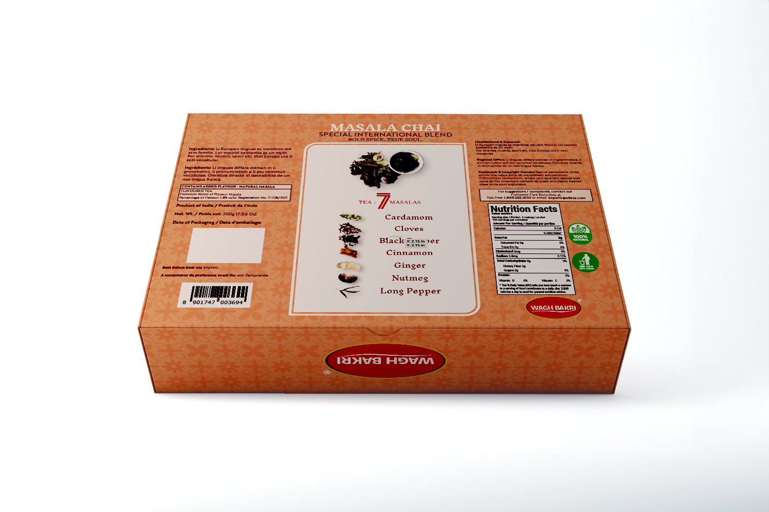
The redesign simplifies a crowded layout and reorders information to establish a stronger hierarchy across panels. Product name, variant, and key details are prioritized, with supporting content grouped into consistent zones for easier scanning in retail conditions.
A warm orange primary palette replaces the dominant red, paired with deep red accents and controlled gold highlights. This shift increases shelf visibility while retaining brand familiarity. A subtle South Asian floral pattern is integrated as a background system, adding cultural context without competing with core information.
Typography is reduced and standardized to improve legibility at distance and in-hand. Iconography and ingredient callouts are consolidated to avoid repetition. The structure is carried across front, back, and side panels to keep the system consistent.
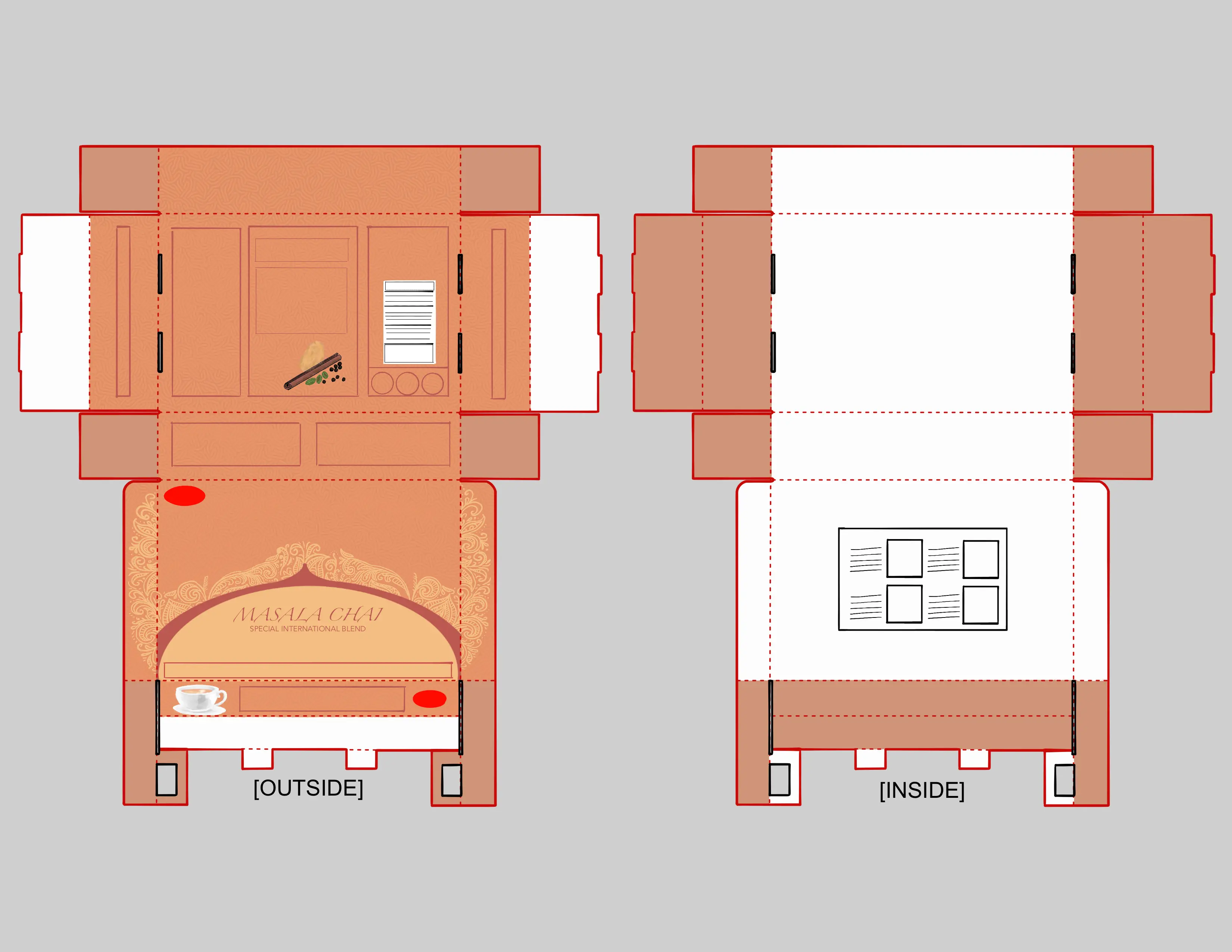
The pack format moves to a functional flip-top box with tab locks, supporting repeated use and a more considered opening experience. The result is a packaging system that reads faster, holds together across touchpoints, and presents the product with more control.